- Details
- Category: Demo Info
Drop Caps
L orem ipsum dolor sit amet, consectetur adipiscing elit. Mauris tristique lobortis orci ac lacinia. Fusce eu purus eget diam vehicula auctor nec eu elit. Morbi consequat facilisis orci vel malesuada. Donec ultrices molestie sollicitudin. Morbi consequat facilisis orci vel malesuada. Donec ultrices molestie sollicitudin. Mauris tristique lobortis orci ac lacinia. Mauris tristique lobortis orci ac lacinia.
L orem ipsum dolor sit amet, consectetur adipiscing elit. Mauris tristique lobortis orci ac lacinia. Fusce eu purus eget diam vehicula auctor nec eu elit. Morbi consequat facilisis orci vel malesuada. Donec ultrices molestie sollicitudin. Morbi consequat facilisis orci vel malesuada. Donec ultrices molestie sollicitudin. Mauris tristique lobortis orci ac lacinia. Mauris tristique lobortis orci ac lacinia.
Porem ipsum dolor sit amet, consectetur adipiscing elit. Mauris tristique lobortis orci ac lacinia. Fusce eu purus eget diam vehicula auctor nec eu elit. Morbi consequat facilisis orci vel malesuada. Donec ultrices molestie sollicitudin. Morbi consequat facilisis orci vel malesuada. Donec ultrices molestie sollicitudin. Mauris tristique lobortis orci ac lacinia. Mauris tristique lobortis orci ac lacinia.
Porem ipsum dolor sit amet, consectetur adipiscing elit. Mauris tristique lobortis orci ac lacinia. Fusce eu purus eget diam vehicula auctor nec eu elit. Morbi consequat facilisis orci vel malesuada. Donec ultrices molestie sollicitudin. Morbi consequat facilisis orci vel malesuada. Donec ultrices molestie sollicitudin. Mauris tristique lobortis orci ac lacinia. Mauris tristique lobortis orci ac lacinia.
Video Overlay
1. Enter the url of your video in the video src area.
2. Enter your background image under the video_overlay_wrap style area. This is the background image that appears before the video loads and at 1024px. Please note that all videos disable at 1024px due to restrictions on tablets and phones.
3. Enter an optional max-height under the video_overlay_wrap style area. This will prevent the video from becoming larger than the height specified.
4. Enter an optional min-height under the video_overlay_wrap style area. This will prevent the video from becoming smaller than the height specified. This is very useful for when the video is disabled at 750px, and the background image shows in its place.
4. Enter an optional width under the video_overlay_wrap style area. This will stretch the video to a specified length, but will be cropped off by the surrounding parent div.
4. Enter your desired text in the video_overlay_text_wrap_inner area. Text should be minimal to avoid any space issues on smaller screens; videos maintain ratio and decrease on smaller devices.
<video muted autoplay="autoplay" loop="loop" src="/Mumblesrestaurants/images/video.mp4"></video>
<div class="video_overlay_text_wrap">
<div class="video_overlay_text_wrap_inner">
Lorem ipsum dolor sit amet, consectetur adipiscing elit. Morbi efficitur scelerisque ligula, sit amet fermentum metus.
<div style="clear:both;height:0px;"></div>
</div>
</div>
</div>
Social Icons
Ion Icons must be enabled to use these icons.
<a href="/Mumblesrestaurants/" class="social_icon ion-social-twitter"></a>
<a href="/Mumblesrestaurants/" class="social_icon ion-social-googleplus"></a>
<a href="/Mumblesrestaurants/" class="social_icon ion-social-rss"></a>
<a href="/Mumblesrestaurants/" class="social_icon ion-social-pinterest"></a>
Notifications
Images
This is an image with the "boxed" class applied:
This is an image with the "boxed_white" class applied:
This is an image with the "boxed_black" class applied:
This is an image with the "padded" class applied:
This is an image with the "full_width" class applied. This can also be done automatically in the template configuration. Be sure to review our Vertex Guide here for other full width image options.

Headings
Heading 1
Heading 2
Heading 3
Heading 4
Heading 5
Ion Icons
<div class="icon_hover">
<a href="/Mumblesrestaurants/" class="ion-link icon_element"></a>
</div>
<div class="icon_non_hover">
<span class="ion-headphone icon_element"></span>
</div>
</div>
Click here for more icon examples
Dates
<div class="date_wrapper">
<div class="date_top">
AUG
</div>
<div class="date_bottom">
22
</div>
</div>
<div class="date_text_wrap">
<span class="date_text1"><a href="/Mumblesrestaurants/">Top Sample Text</a></span>
<span class="date_text2">When: August 22, 2014 at 7:00pm</span>
</div>
<div style="clear:both"></div>
</div>
Overlay

Michelle Wright
Senior Developer

Photos credits by Daniele Zedda, JohnONolan, Daniele Zedda, Daniele Zedda, AllansBrain, rolands.lakis
<div class="overlay_outer four">
<div class="overlay_inner">
<div class="overlay_hover_outer">
<div class="overlay_hover_inner">
<div class="overlay_socialicons">
<a class="overlay_facebook" href="https://www.facebook.com/shape5.templates" target="_blank"></a>
<a class="overlay_twitter" href="https://twitter.com/shape_5" target="_blank"></a>
</div>
</div>
<img src="http://www.shape5.com/demo/images/general/team/team1.jpg" alt="team1"/>
</div>
<br>
Mike Summerfield
<br>
<span style="color:#a8a8a8;">CEO/Owner</span>
<br> </div>
</div>
Video Play Overlay
<div class="overlay_hover_outer">
<div class="overlay_hover_video">
<div class="overlay_centered">
<a href="http://www.youtube.com/v/VGiGHQeOqII" id="youtube" class="s5mb" title="Youtube.com Video">
<span class="ion-play ion-play-size"></span>
</a>
<div class="s5_multibox youtube">UP: Carl and Ellie </div>
</div>
</div>
<img src="http://www.shape5.com/demo/images/general/typography_vidplay.jpg" alt="iphone vid" />
</div>
</div>
Image Hover Zoom
<div class="image_hover_zoom_text">
Overlay Text
</div>
<img src="http://www.shape5.com/demo/images/general/typography_vidplay.jpg" alt="" />
</div>
Misc
<a> With readon class applied:readon
<span> With uppercase class applied:
uppercase
This is a sample blockquote. Use <blockquote><p>Your content goes here!</p></blockquote> to create a blockquote.
#s5_code { width: 30px; color: #fff; line-height: 45px; }
- This is an Ordered List
- Congue Quisque augue elit dolor nibh.
- Condimentum elte quis.
- Opsum dolor sit amet consectetuer.
- This is an Unordered List
- Congue Quisque augue elit dolor nibh.
- Condimentum elte quis.
- Opsum dolor sit amet consectetuer.
- This is an Unordered List with class ul_arrow
- Congue Quisque augue elit dolor nibh.
- Condimentum elte quis.
- Opsum dolor sit amet consectetuer.
- This is an Unordered List with class ul_star
- Congue Quisque augue elit dolor nibh.
- Condimentum elte quis.
- Opsum dolor sit amet consectetuer.
- This is an Unordered List with class ul_bullet
- Congue Quisque augue elit dolor nibh.
- Condimentum elte quis.
- Opsum dolor sit amet consectetuer.
The following list will support plain text such as numbers of ion icons, class="ul_circle_content":
- 01Lorem ipsum dolor sit amet, consectetur adipiscing elit. Sed ut mattis quam. Suspendisse tempor mollis porta. Quisque consequat justo risus, et venenatis erat consectetur sit amet. Curabitur varius tortor metus, non convallis felis fermentum sed. Nam varius justo nulla, et ultricies augue venenatis ut. Proin tempor aliquam dapibus. Pellentesque euismod vehicula est, a euismod lacus feugiat sit amet.
- 02Lorem ipsum dolor sit amet, consectetur adipiscing elit. Sed ut mattis quam. Suspendisse tempor mollis porta. Quisque consequat justo risus, et venenatis erat consectetur sit amet. Curabitur varius tortor metus, non convallis felis fermentum sed. Nam varius justo nulla, et ultricies augue venenatis ut. Proin tempor aliquam dapibus. Pellentesque euismod vehicula est, a euismod lacus feugiat sit amet.
- 03Lorem ipsum dolor sit amet, consectetur adipiscing elit. Sed ut mattis quam. Suspendisse tempor mollis porta. Quisque consequat justo risus, et venenatis erat consectetur sit amet. Curabitur varius tortor metus, non convallis felis fermentum sed. Nam varius justo nulla, et ultricies augue venenatis ut. Proin tempor aliquam dapibus. Pellentesque euismod vehicula est, a euismod lacus feugiat sit amet.
- Lorem ipsum dolor sit amet, consectetur adipiscing elit. Sed ut mattis quam. Suspendisse tempor mollis porta. Quisque consequat justo risus, et venenatis erat consectetur sit amet. Curabitur varius tortor metus, non convallis felis fermentum sed. Nam varius justo nulla, et ultricies augue venenatis ut. Proin tempor aliquam dapibus. Pellentesque euismod vehicula est, a euismod lacus feugiat sit amet.
The following list will support lists up to number 9, add the following class to the UL wrapping the below LI elements, class="ul_numbers":
- This is a sample styled number list <li class="li_number1">Your content goes here!</li>
- This is a sample styled number list <li class="li_number2">Your content goes here!</li>
- This is a sample styled number list <li class="li_number3">Your content goes here!</li>
- This is a sample styled number list <li class="li_number4">Your content goes here!</li>
Price Table
<div class="s5_pricetable_3">
<div class="s5_pricetable_column">
<div class="s5_pricetable_column_padding">
<div class="s5_title">Basic</div>
<div class="s5_price_wrap">
<span class="dollarsign">$</span><span class="price">49</span><span class="month">/per month</span>
</div>
<div class="s5_options">
<div class="s5_option">
Unlimited Space & Traffic
</div>
<div class="s5_option">
99.9% Server Uptime
</div>
<div class="s5_option">
24/7 Customer Care
</div>
<div class="s5_option">
30 Days Money Back
</div>
</div>
<div class="s5_horizontalrule"></div>
<div class="s5_buttoncenter"><a class="button s5_pricetable" href="#">Choose</a></div>
</div>
</div>
<div class="s5_pricetable_column recommended">
<div class="s5_pricetable_column_padding">
<div class="s5_title">Standard</div>
<div class="s5_price_wrap">
<span class="dollarsign">$</span><span class="price">79</span><span class="month">/per month</span>
</div>
<div class="s5_options">
<div class="s5_option">
Unlimited Space & Traffic
</div>
<div class="s5_option">
99.9% Server Uptime
</div>
<div class="s5_option">
24/7 Customer Care
</div>
<div class="s5_option">
30 Days Money Back
</div>
<div class="s5_option">
FREE Domain Name
</div>
<div class="s5_option">
Personal Concierge
</div>
</div>
<div class="s5_horizontalrule"></div>
<div class="s5_buttoncenter"><a class="button s5_pricetable" href="#">Choose</a></div>
</div>
</div>
<div class="s5_pricetable_column">
<div class="s5_pricetable_column_padding">
<div class="s5_title">Premium</div>
<div class="s5_price_wrap">
<span class="dollarsign">$</span><span class="price">99</span><span class="month">/per month</span>
</div>
<div class="s5_options">
<div class="s5_option">
Unlimited Space & Traffic
</div>
<div class="s5_option">
99.9% Server Uptime
</div>
<div class="s5_option">
24/7 Customer Care
</div>
<div class="s5_option">
30 Days Money Back
</div>
</div>
<div class="s5_horizontalrule"></div>
<div class="s5_buttoncenter"><a class="button s5_pricetable" href="#">Choose</a></div>
</div>
</div>
<div style="clear:both;"></div>
</div>
Responsive YouTube and Vimeo Videos
Make any Youtube, Vimeo, etc video you embed to your site work with responsive by wrapping with a DIV with a class of "s5_video_container". The below Youtube Video will shrink when the area its contained in gets too small for it:- Details
- Category: Demo Info
Demo 1:

Demo 2:
Demo 2 Image Tool Tip
Demo 3:
Demo 3 Image Tool Tip
- Details
- Category: Demo Info
- 01In the backend of Joomla go menu item Extensions/Template Manager.
- 02Click on the title of the template.
- 03This will bring you to the template manager screen where you can edit the template's parameters.
- 04Click save when you are done
- Details
- Category: Demo Info
Every template built on Vertex also comes with its own unique template specific options applicable to that particular template such as highlight colors, social icons, and much more. These features are in addition to the standard functions of Vertex, and are still controlled through the very user friendly interface of Vertex. This page will document the features specific to this template.
Theme Specific Configuration Interface of Vertex
Below is a screenshot that shows all the template specific features available in the user friendly Vertex admin: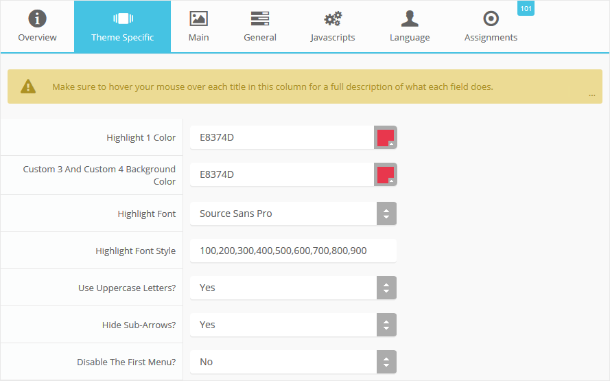
Custom Highlight Colors
Stylize your site with any color you want. Set your own custom color scheme with the built in highlight colors. These control menu items, titles, buttons, hover over effects, backgrounds, and much more. You can set this color to any color that you want. The custom_3 and custom_4 background area can also be independently controlled. Below is an example so you can see how this works.
Custom Highlight Font
Choose a custom highlight font powered by Google fonts. You can set a custom font for the titles, buttons, and much more. This is used in conjunction with the default site font which is controlled under the Layout tab of Vertex, and controls many other elements as well.
Uppercase Letters
Choose to enable or disable uppercase letters on most menu items, buttons, titles and more.
Hide Menu Arrows
With this option you can disable the menu item sub menu arrows on first level parent items.
S5 Box Login and Register
The S5 Box Login and Register popups are not demo'd here, but can be seen at this page.
- Details
- Category: Demo Info
- Details
- Category: Demo Info
So what are Site Shapers? They are quick installs of Joomla combined with all the modules, content, etc used on our demo, excluding stock photography. Within a few minutes you can have your site up, running and looking just like our demo. No more importing SQL dumps and installing modules. Just head on over to the download section of this template and grab a Site Shaper. Simply install the Site Shaper like any other Joomla installation, it's that easy!
How to setup a Site Shaper
- 01Login to your cpanel or your server admin panel.
- 02Locate the area where your databases are (usually labeled Mysql Databases)
- 03Create a new database
- 04Next create a new database user and assign it to this newly created database in the previous step
- 05You will then need to extract the site shaper to either a folder on your server or the root directory such as WWW. NOTE: if you already have a website in the root of your WWW folder, we suggest creating a new folder and extract the site shaper there. If your cpanel does not have an extract option or you cannot find it, you may also extract the contents of your site shaper in to a folder on your desktop and upload all the files via an ftp client to your server.
- 06Next, navigate to the url where you extracted the site shaper via your web browser.
- 07Continue through each screen until you reach the below screenshot:
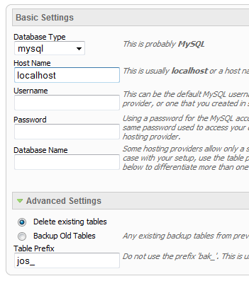
- 08At the above screen be sure to enter localhost as shown, continue to fill in the following text fields with your newly created database and username information
- 09Follow through the rest of the site shaper setup and click the install sample data at the last screen and the installation is complete! (be sure to rename/remove the installation directory after finishing the install)
- Details
- Category: Demo Info
SEO - Get your site noticed!
Not only is this template beautifully designed but it is great for search engine optimization as well! What is SEO? It is simple the act of altering a web site so that it does well in the organic, crawler-based listings of search engines such as google.com. How does this template accomplish this? It's simple, the majority of your most valuable content is found in the main body of your site, through css we are able to alter the layout of the site and call the main content before the left and right columns are called. This allows for your content to be found first by search engines before it reaches your other content, which is vital in search engine optimization. This is a common feature this can be done with almost all of Shape 5 templates as well.
- Details
- Category: Demo Info
The S5 Tab Show will display up to 20 modules in various styles within sliding tabs, and is compatible with responsive sites. Simply publish the S5 Tab Show module to your desired module position and pages. Then start publishing modules to the positions in the Tab Show (s5_tab1, s5_tab2, etc); these modules will become the slides. This is a great way to organize and showcase your site's content or images. Version 3 of this module is incredibly powerful, below is a list of all of its features.
- Transitions are powered by CSS3, so no javascript conflicts
- Optional custom classes
- Up to 10 copies of the module on the same pages; each individually controlled
- Use up to 20 slides
- Select on mouseover or on click for activation
- Set the loation of the tabs or arrows
- Center the tabs or arrows
- Hide the tabs or arrows until mouseover
- Force the tabs or arrows to be shown for tablets and mobile devices
- Select your transition effect
- Set your duration speed
- Add extra padding in between slides or no padding at all
- Optional button text for tabs
- Optional images for tab buttons
- Set a background color or image for each slide or the entire module
- Enter pre-text and post-text
- Details
- Category: Demo Info
Features at a glance
- Responsive layout compatible
- Choose between 4 slide transitions: Fade, Continuous Horiztonal, Fade Slide Left, Continuous Vertical
- Specify height and width of module
- Includes a gallery tab drop down to show all images
- Each image slide can have its own hyperlink
- Show up to 10 images at once
- Publish your own content to each picture slide
- Navigation arrows
- Not all slides require titles
- Change delay time
- Hide or show: Navigation arrows, thumbnail carousel and popup text
- Details
- Category: Demo Info
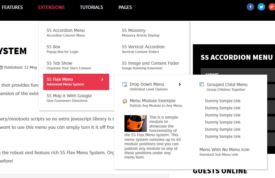
This menu system works off of the core Joomla jquery/mootools scripts so no extra javascript library is needed and keep download sizes to a minimum. Also, if you do not want to use this menu you can simply turn it it off from the template configuration page.
Take your website to the next design level by using the robust and feature rich S5 Flex Menu System. Organize your links with ease and show content in places you never could before!
Menu Features:
- Automatic onclick functionality for tablet sized touch screens. If a device's screen is detected as touch screen and is of table size, then the menu will function with an onclick method rather than the onmouseover effect that is shown on a laptop or desktop that has a mouse for use.
- Multiple javascript effects such as fade, slide, etc.
- Multiple columns for menu items or modules.
- Modules load directly into the menu.
- Group sub menu items into the same column or fly out.
- Optional sub texts for each menu item.
- Optional menu icon images for each menu item.
- Automatic multi-language menu change. If you are setting up a multi-language site, the flex menu will automatically change if your site's visitor has a language specific menu setup for their language in the menu manager.
- And much more!
Menu Screenshot: